
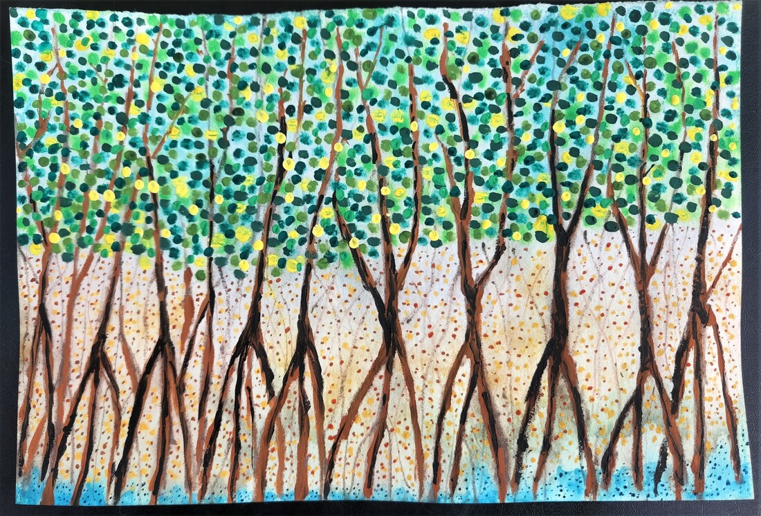
The Kickstarter for Swampscapes is live HERE.
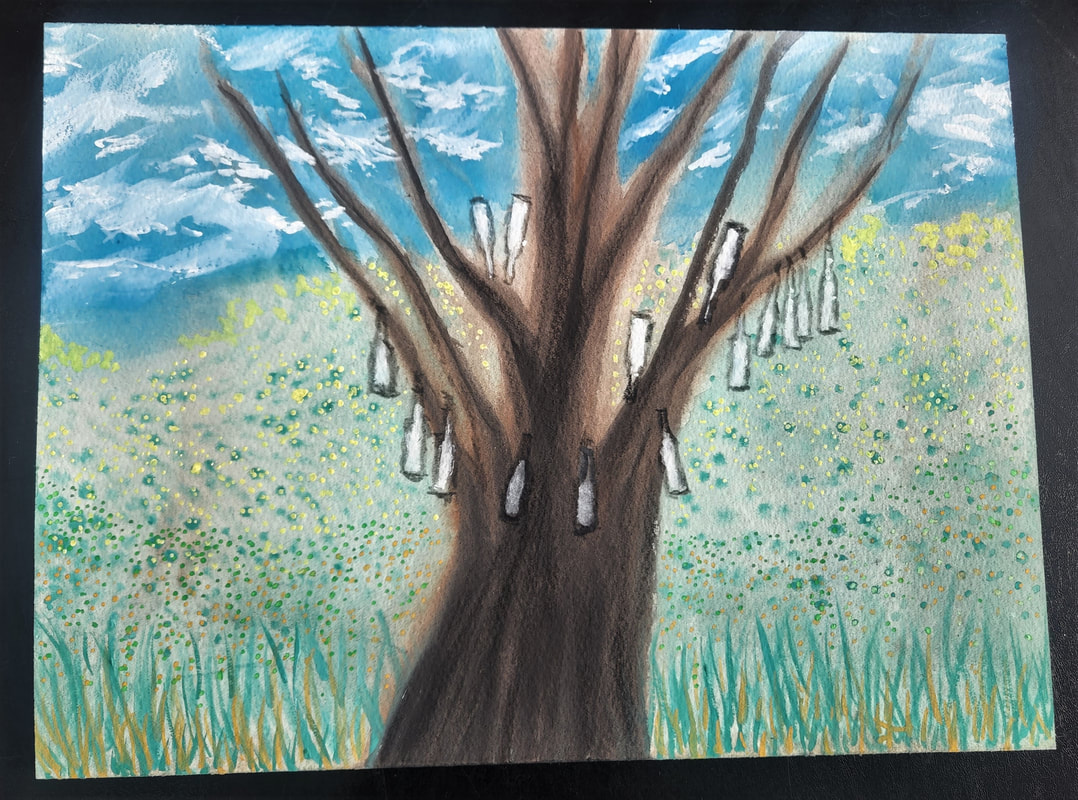
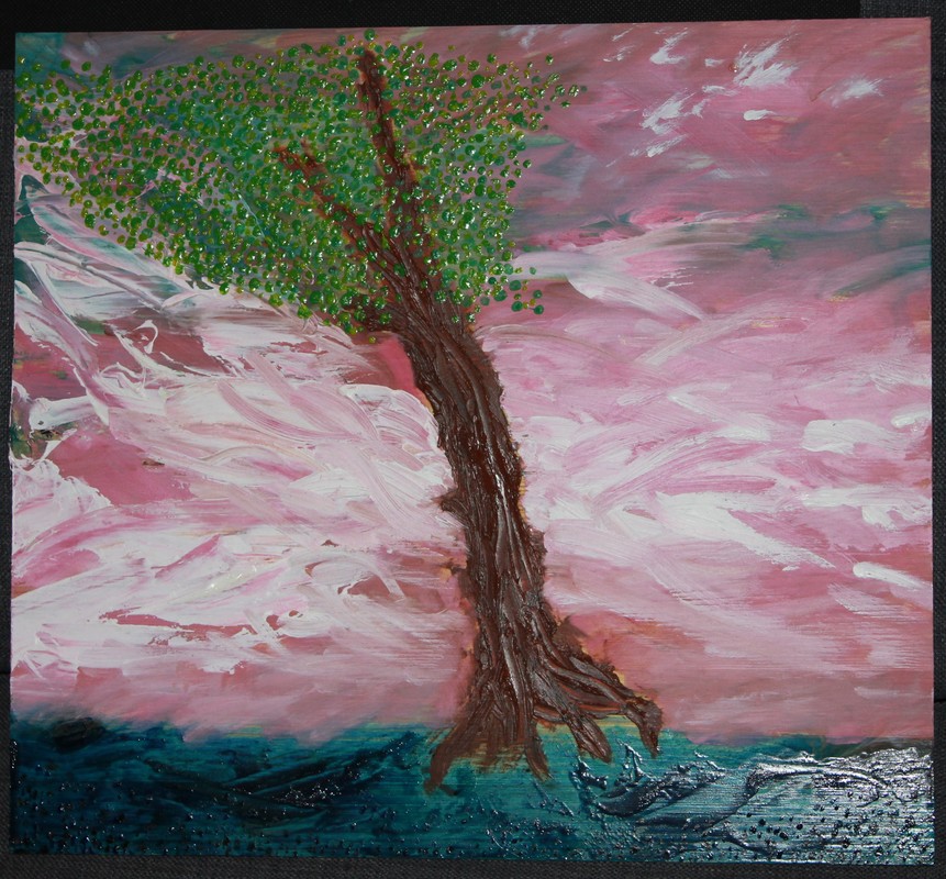
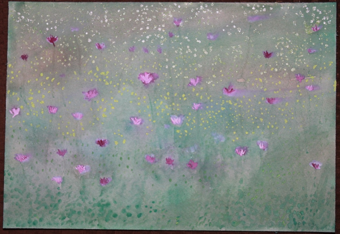
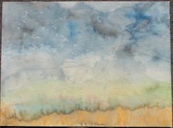
The painting to the left is on Arches paper (140 lb) 9"x6".
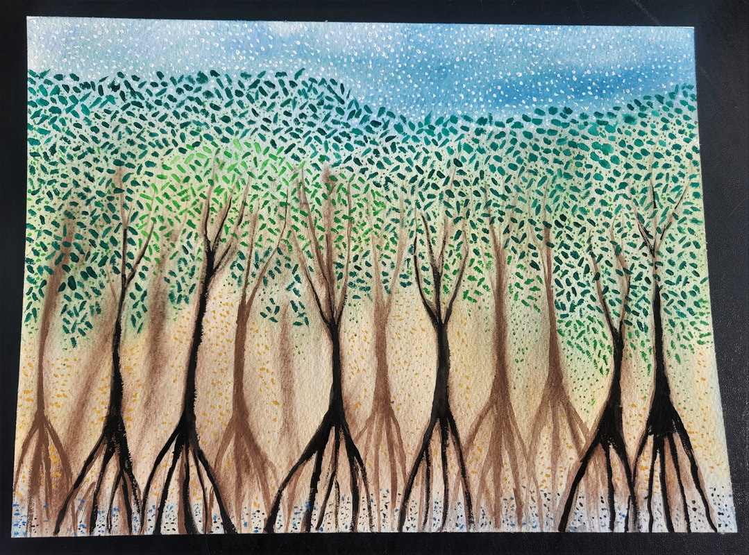
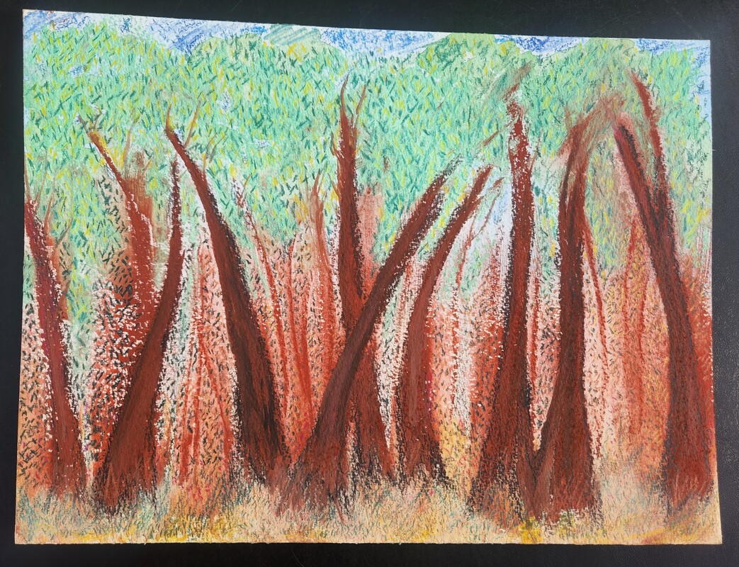
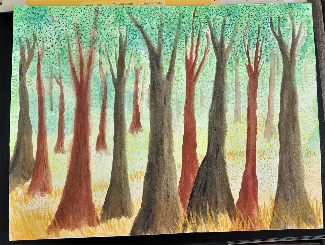
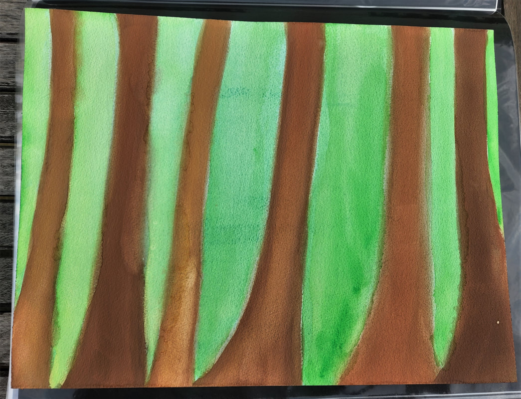
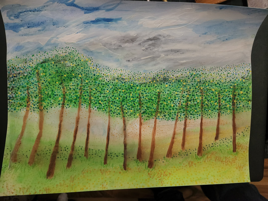
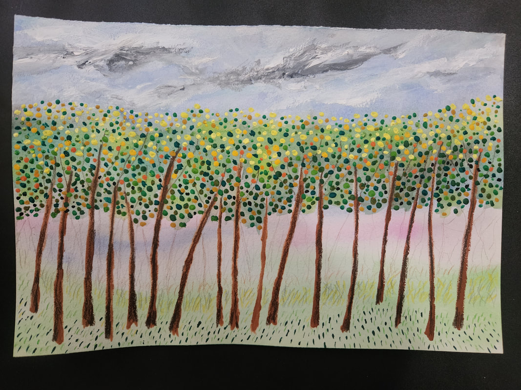
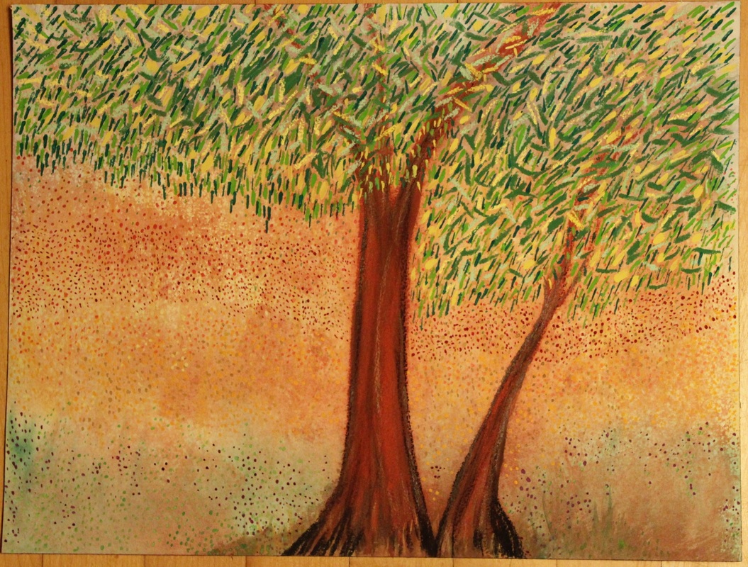
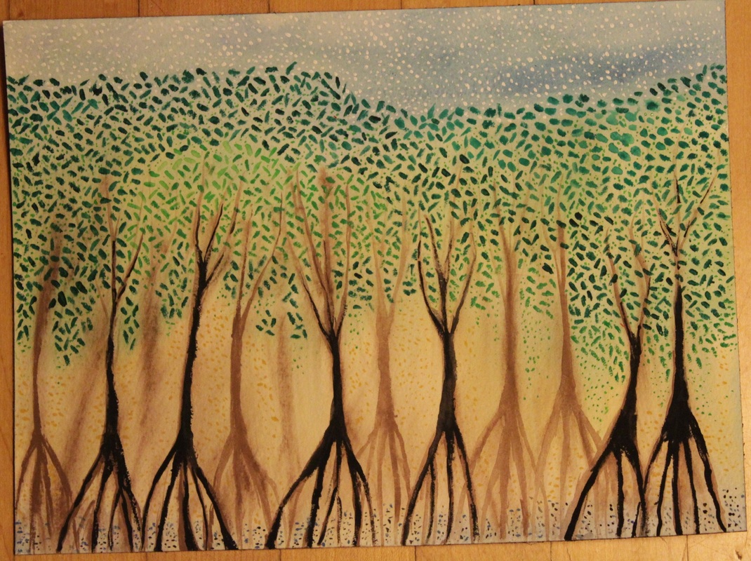
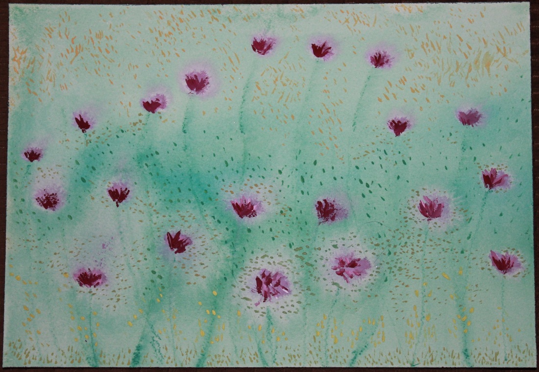
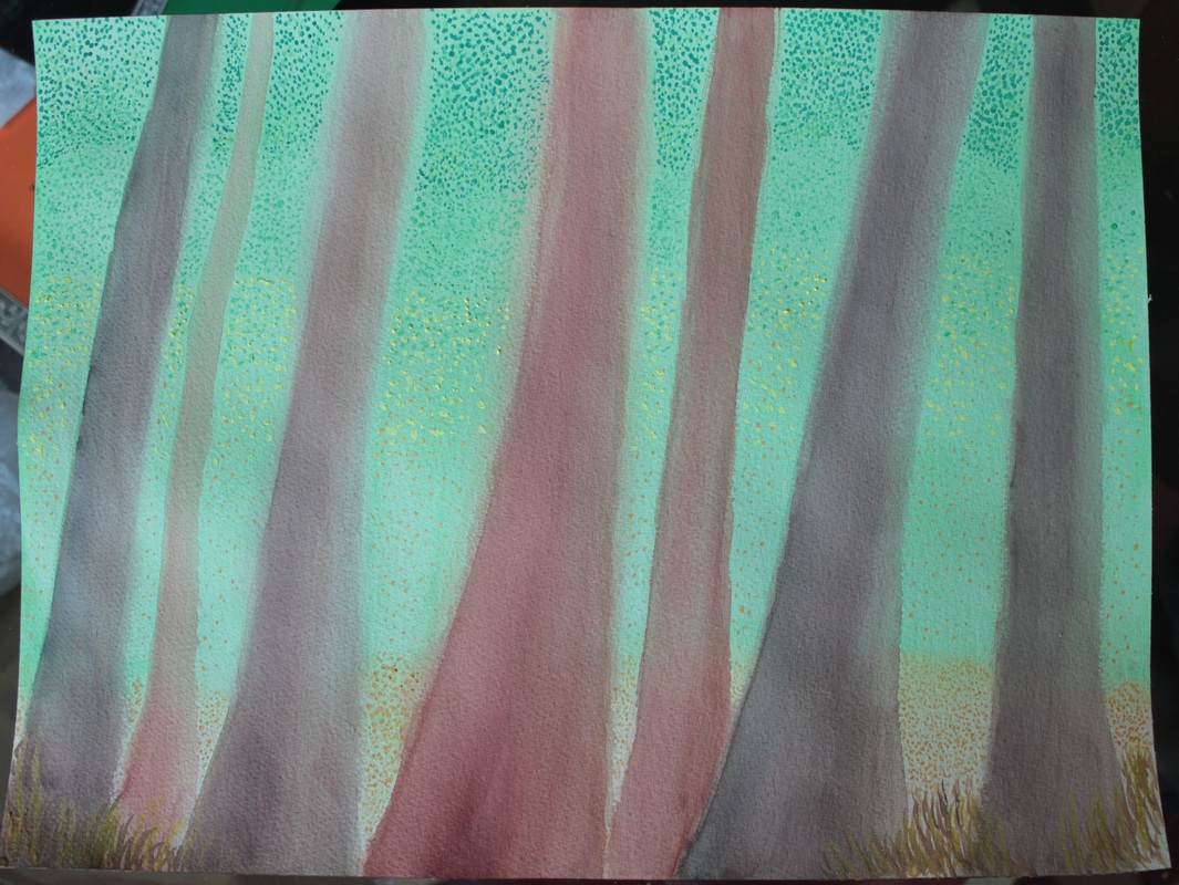
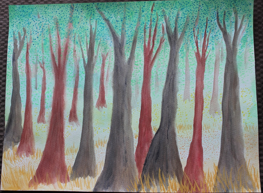
The first three pieces below are on Arches paper (300 lb) 9x12. The fifth piece is on Arches paper (140 lb) 9x6. Number four and six are both on Arches paper (140 lb) 12"x16."
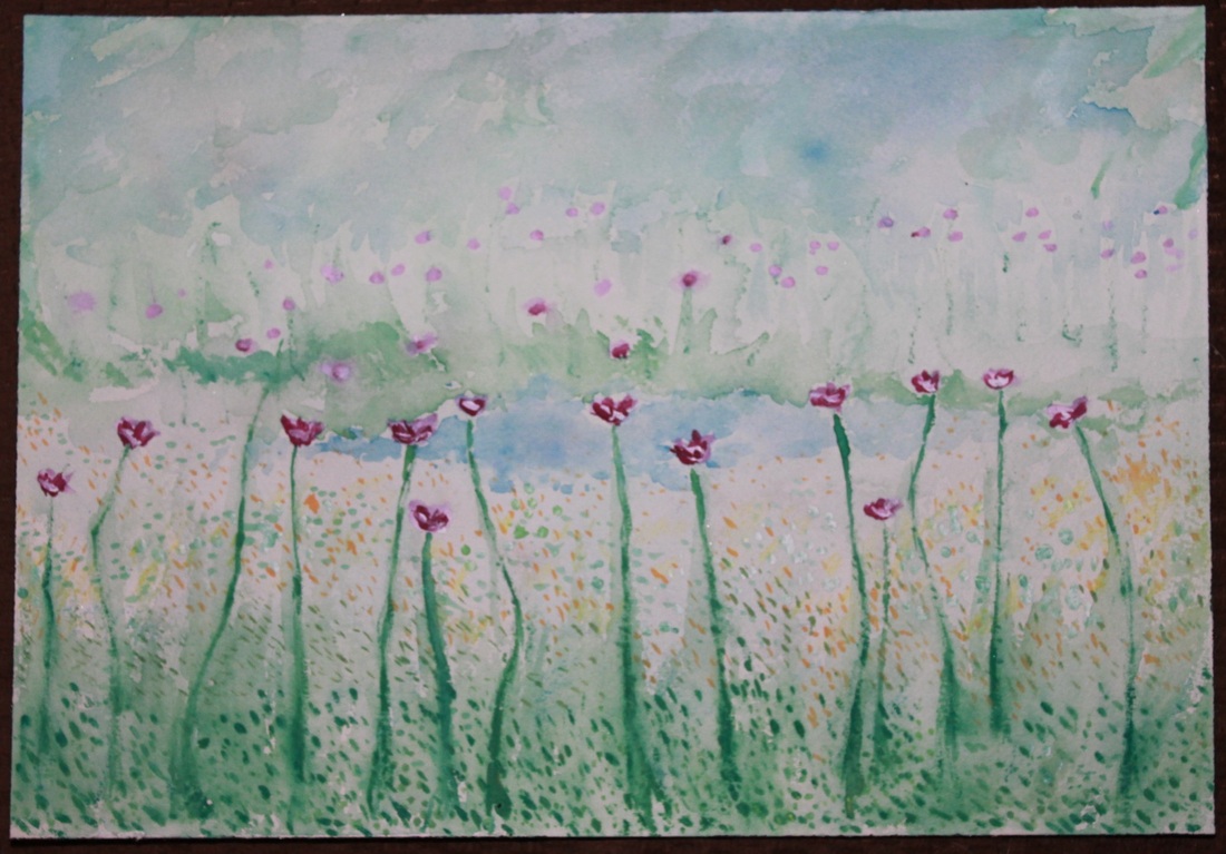
The painting to the left is on Arches paper (140 lb) 9"x6".
The first three pieces below are on Arches paper (300 lb) 9x12. The fifth piece is on Arches paper (140 lb) 9x6. Number four and six are both on Arches paper (140 lb) 12"x16."
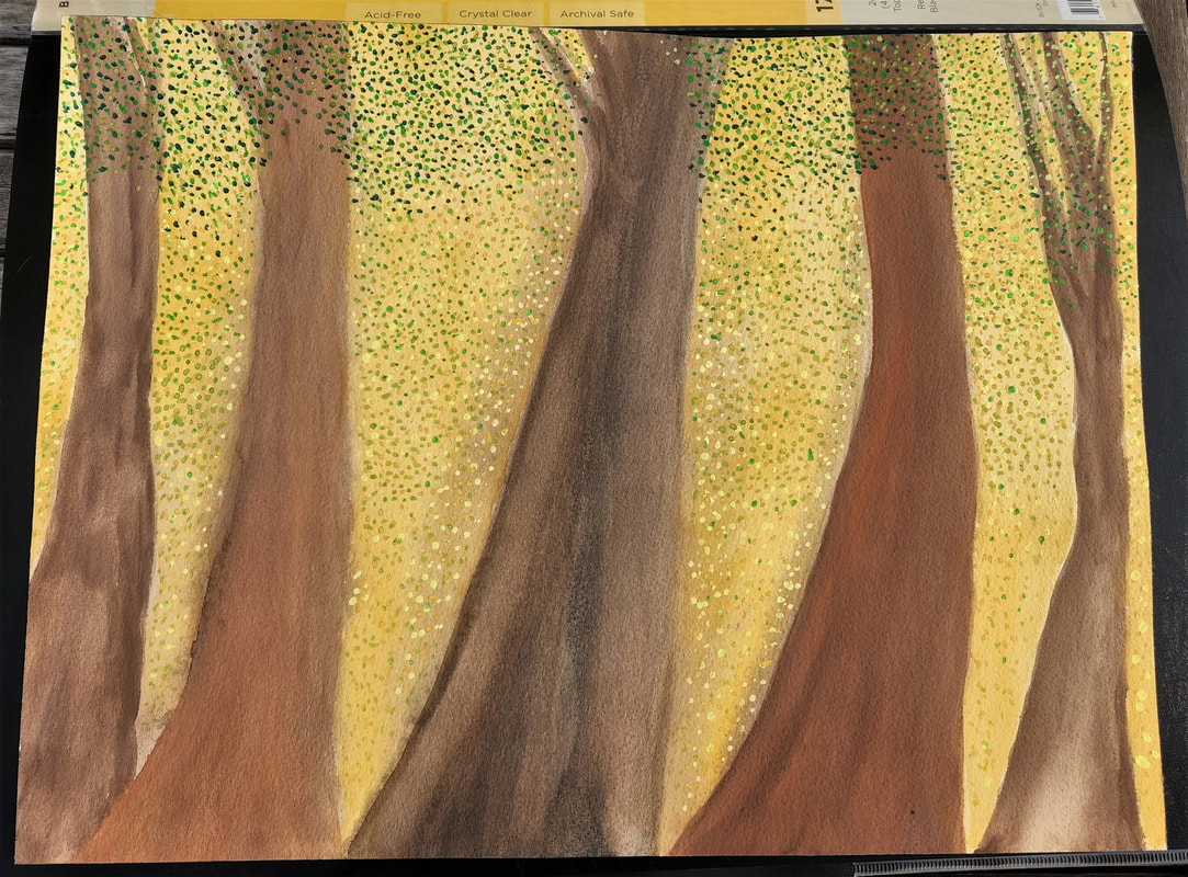
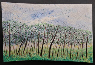
The below are not quite finished. The first two are on Arches paper (300 lb) 9x12 and the third is on Arches paper (140 lb) 12x16.
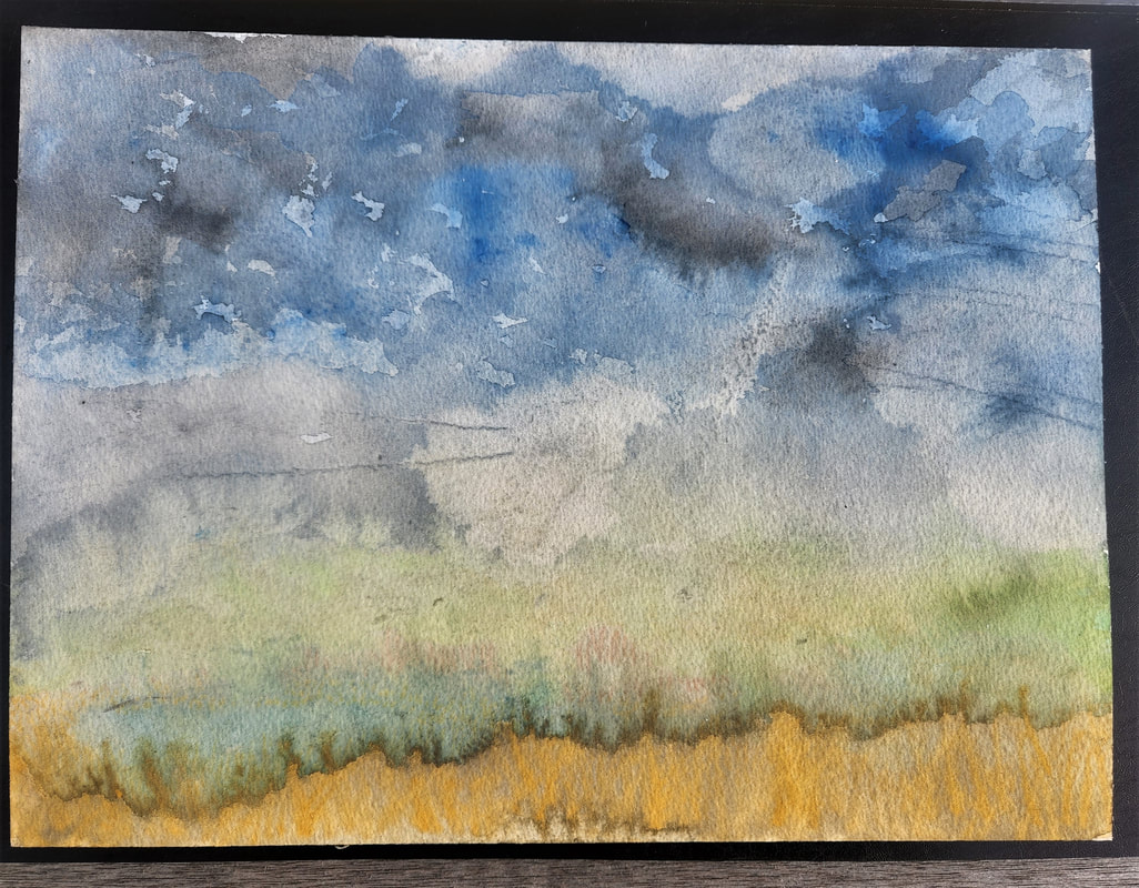
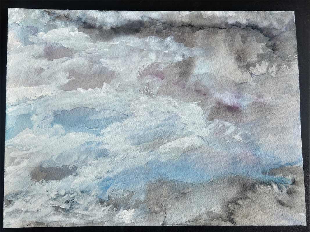
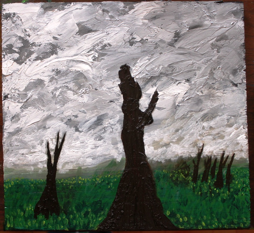
A finished painting of clouds below...This one is Arches paper (300 lb) 9x12.
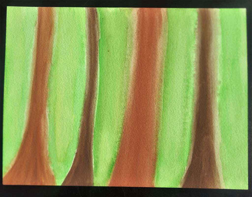
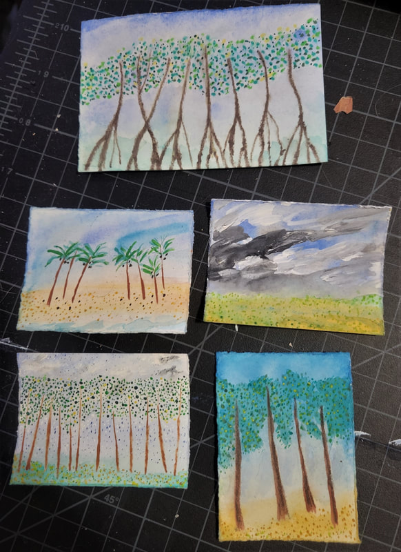
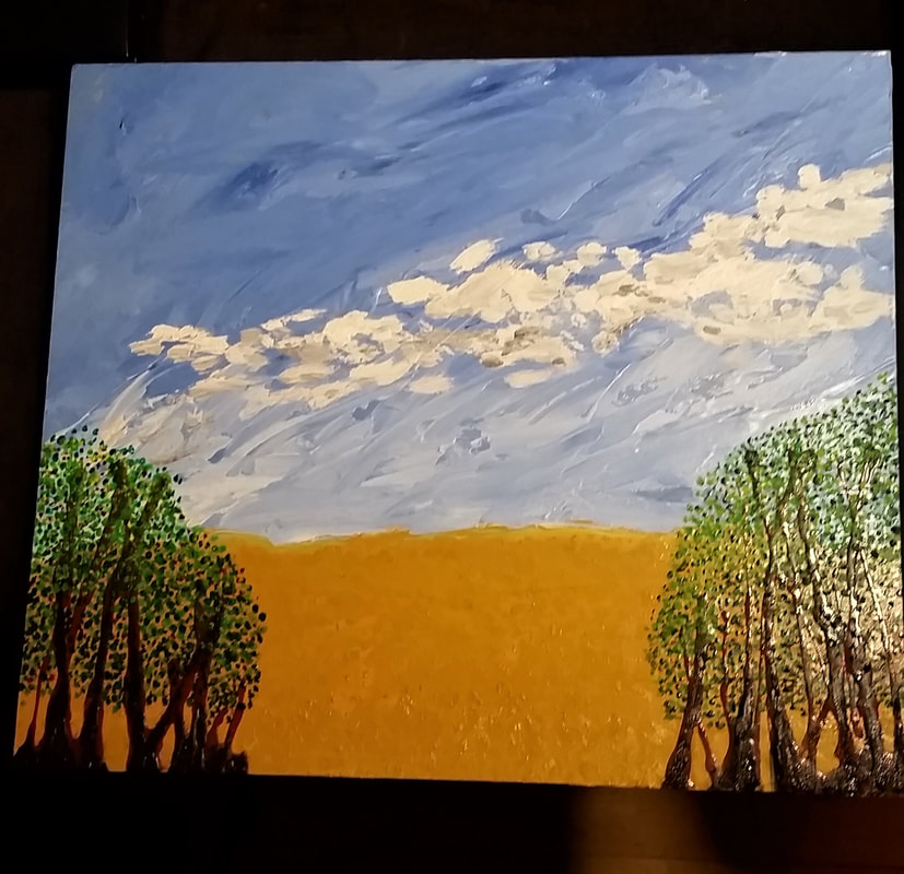
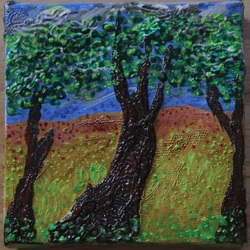
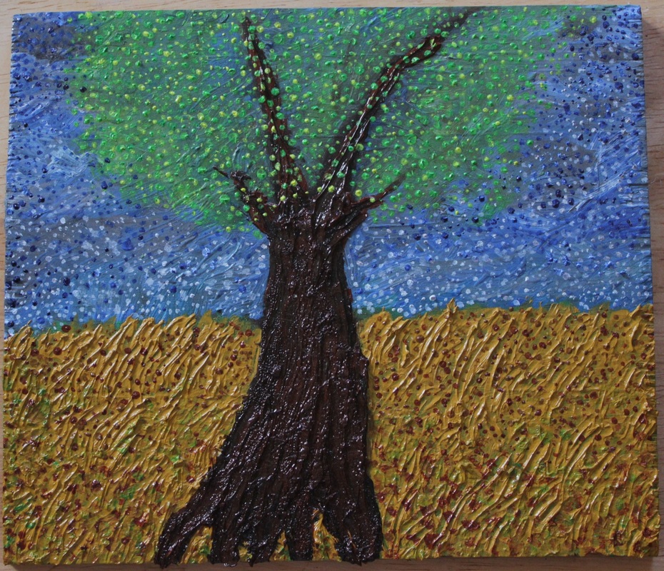
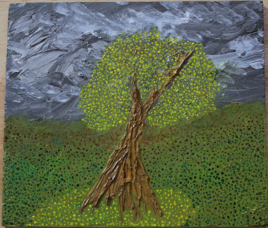
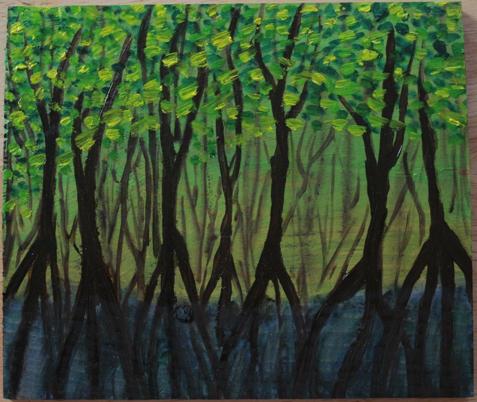
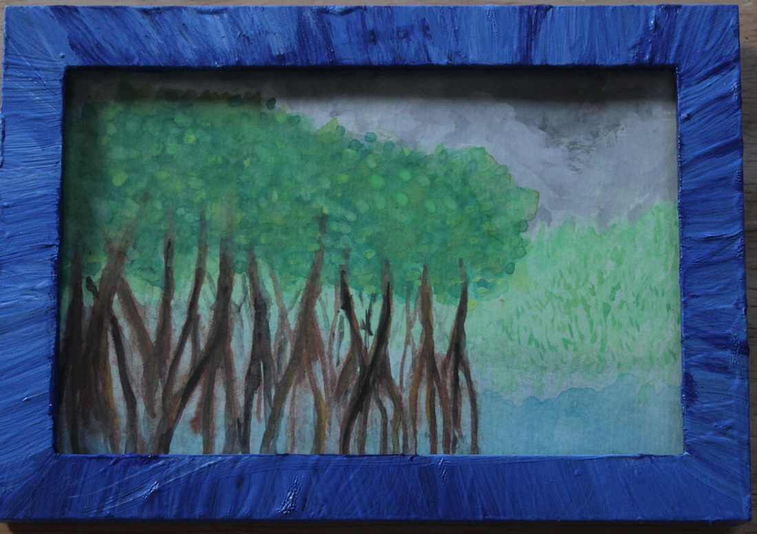
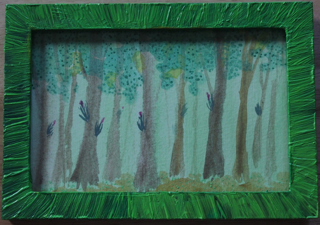
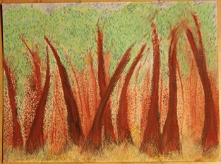
The below pieces are on Arches paper in various small sizes. Most of these are not finished. Hard to take photos of them.


 RSS Feed